Repeat

Sustainable Period Panties

Duration

4 weeks

Industry

Underwears

Client

Repeat Undies

Services

Branding, Art Direction, Packaging, Digital Design

Repeat

Sustainable Period Panties

Duration

4 weeks

Industry

Underwears

Client

Repeat Undies

Services

Branding, Art Direction, Packaging, Digital Design

Repeat

Sustainable Period Panties

Duration

4 weeks

Industry

Underwears

Client

Repeat Undies

Services

Branding, Art Direction, Packaging, Digital Design

Abstract red fluid lattice forming soft diamond shapes on a pale pink background—minimal geometric texture.

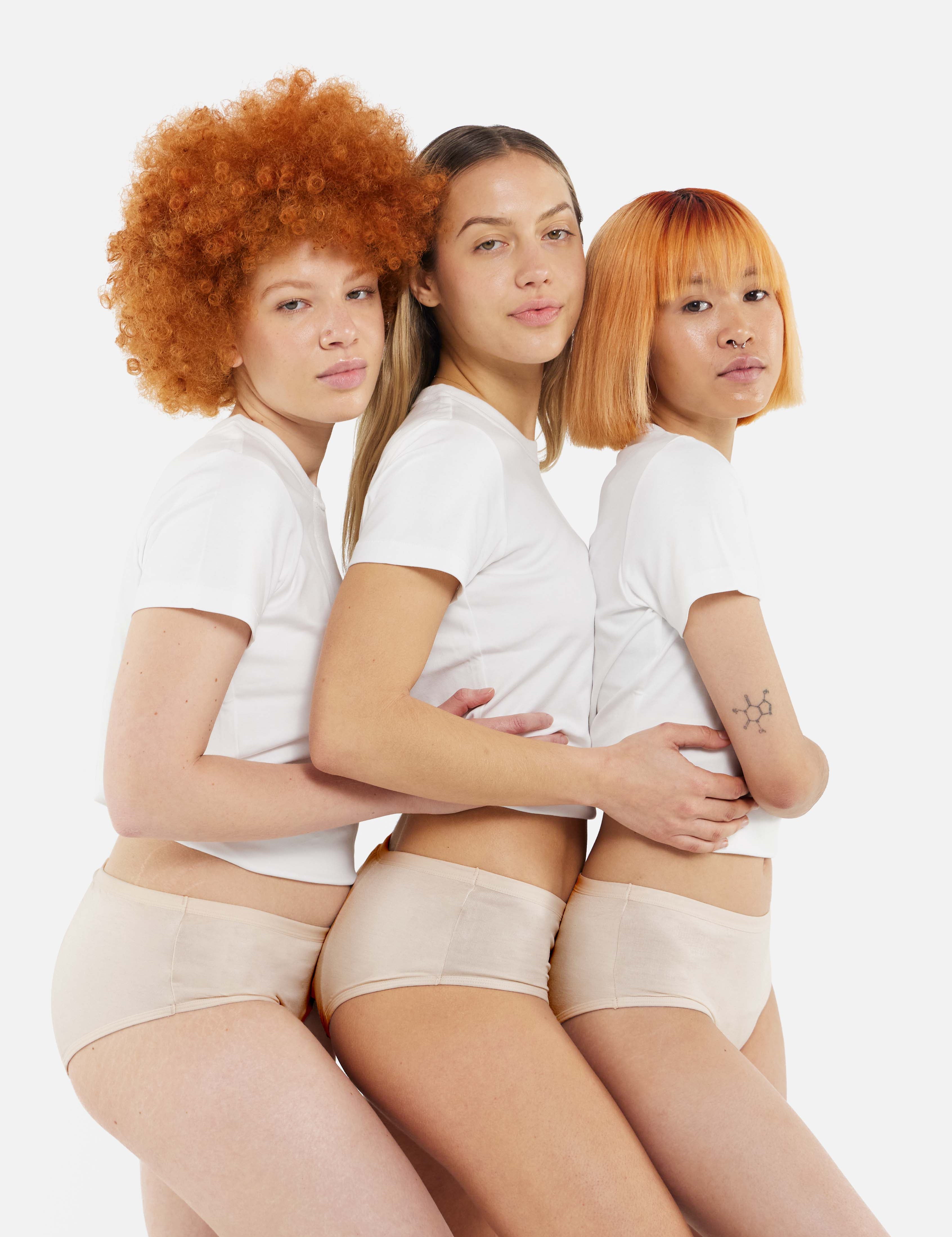
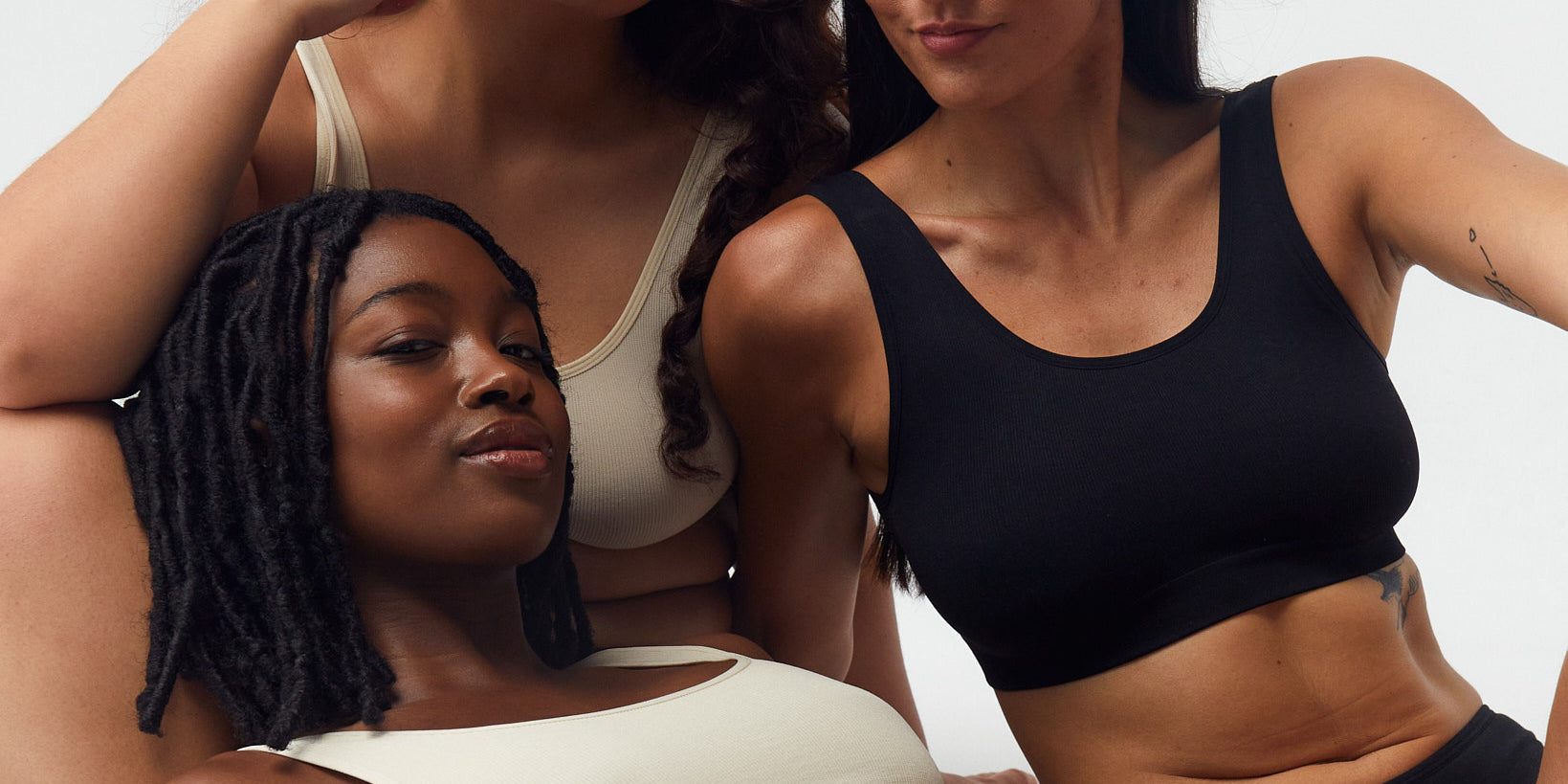
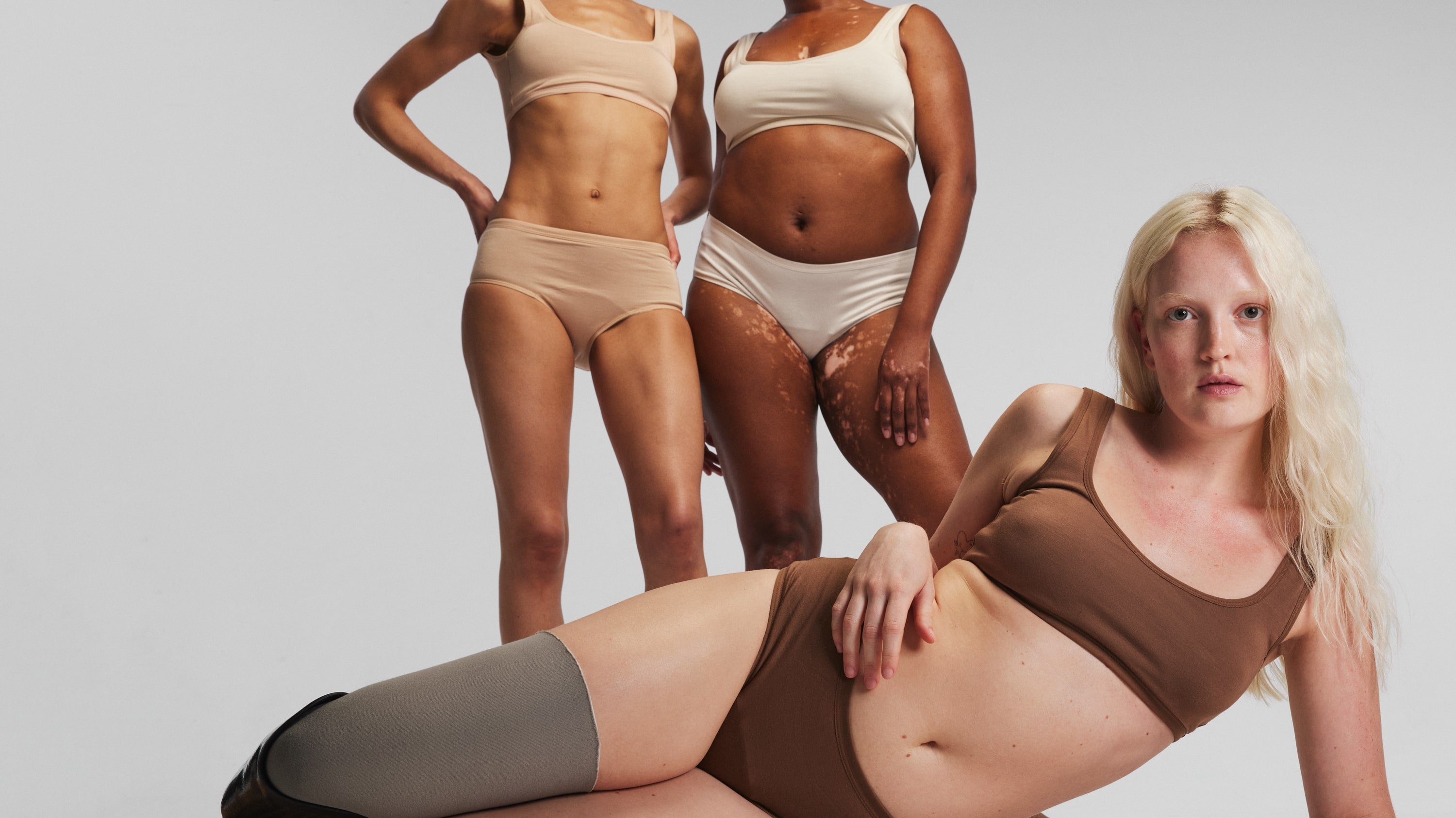
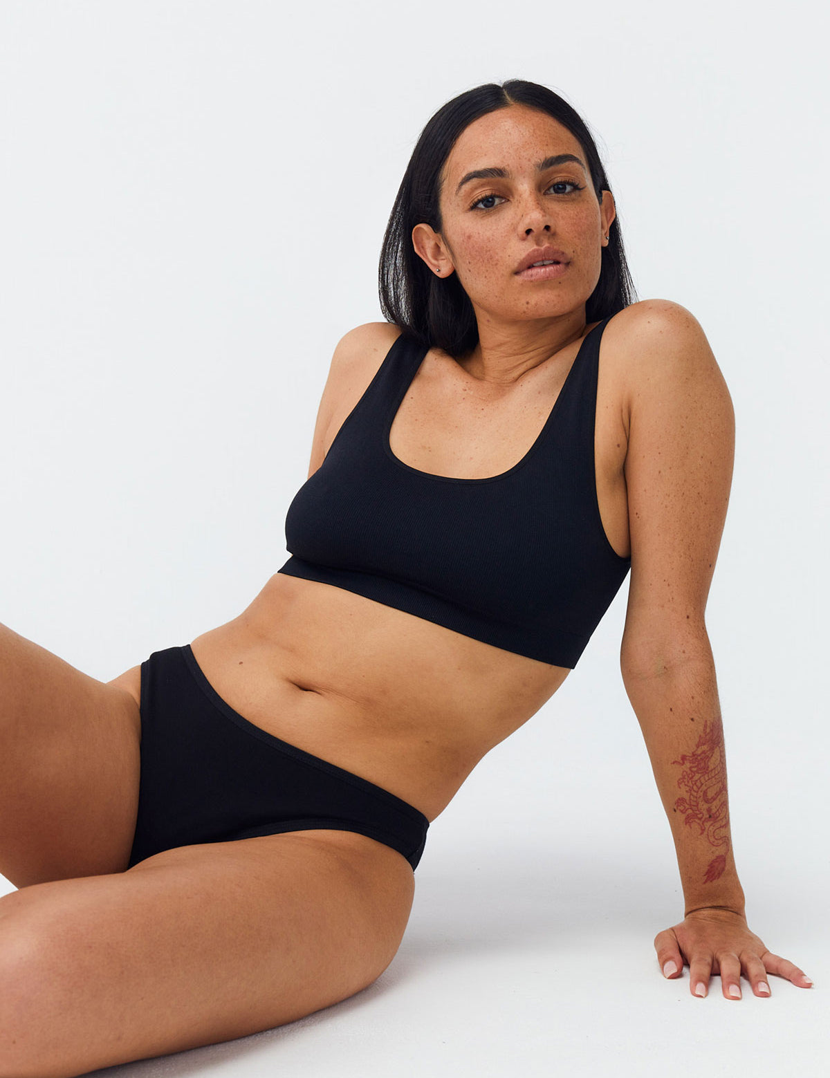
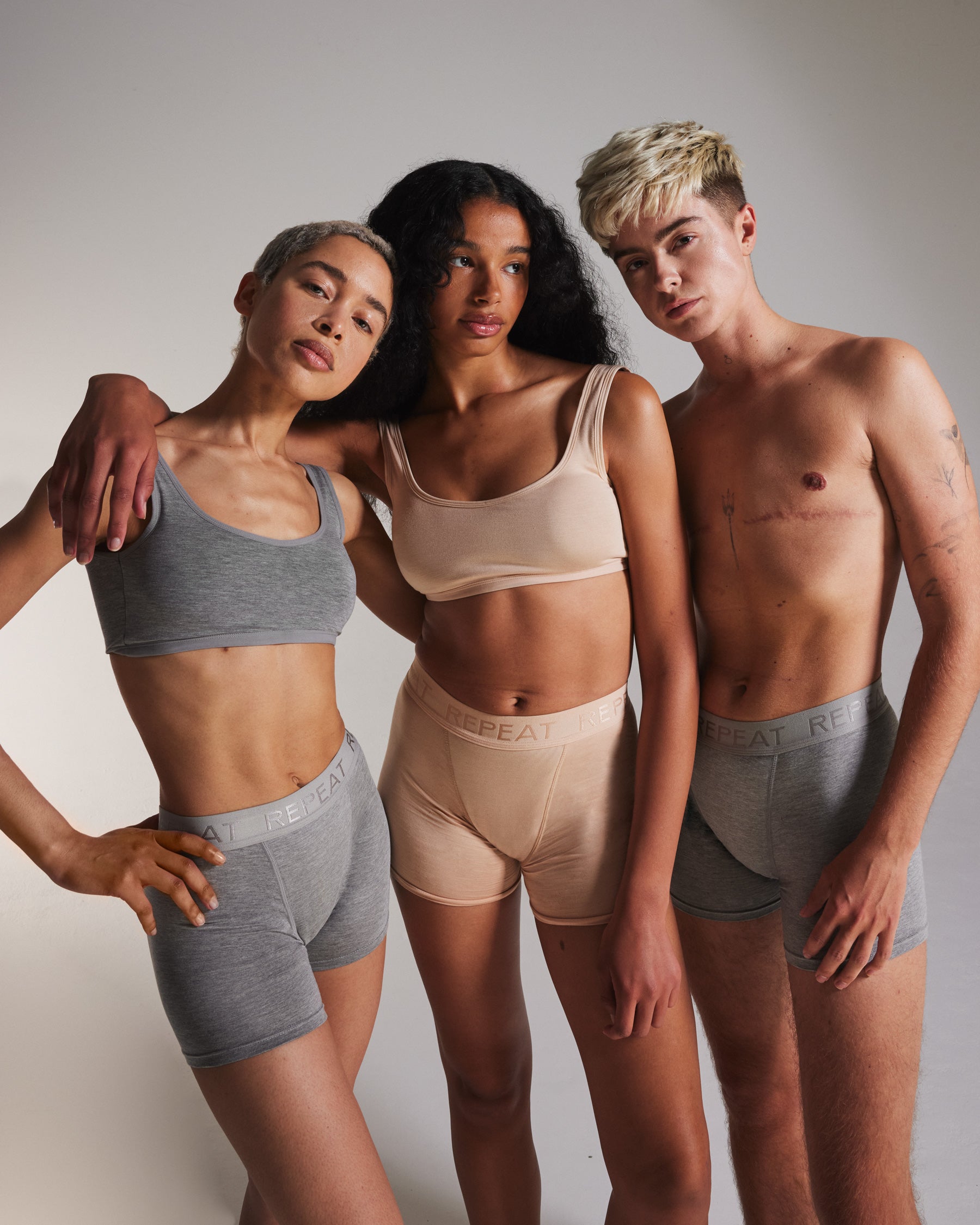
We fight against period poverty because we’re tired of overpriced period panties.
With REPEAT, we’ve managed to combine high quality with affordability by delivering directly to you. This reduces the carbon footprint and avoids unnecessary mark-ups. Consciously, we’ve chosen to keep our margins small, while other period underwear brands charge three times the price. We’re also the first inclusive French brand that speaks to menstruating people, not just women, because it’s not only women who have periods.

results.

It looks and feels like normal plastic. But the special thing about the Biobrush toothbrush is - it is made from bioplastic from wood waste! Sourced from sustainable, local forestry, these toothbrushes not only minimize environmental impact but also boast shorter delivery routes, reducing CO2 emissions. Remarkably, both the product and its packaging are 96% biodegradable! It looks and feels like normal plastic. But the special thing about the Biobrush toothbrush is - it is made from bioplastic from wood waste! Sourced from sustainable, local forestry, these toothbrushes not only minimize environmental impact but also boast shorter delivery routes, reducing CO2 emissions. Remarkably, both the product and its packaging are 96% biodegradable!

It looks and feels like normal plastic. But the special thing about the Biobrush toothbrush is - it is made from bioplastic from wood waste!

Project Overview


MACON partnered with The Circle Agency to redefine its brand presence through a modern, minimal, and sustainable lens. Our goal was to craft an identity that embodies effortless luxury — one that feels timeless yet forward-thinking. From brand storytelling to visual direction, every element was designed to reflect confidence, elegance, and purpose. The result is a cohesive brand experience that captures MACON’s philosophy: fashion that inspires, empowers, and endures.

Our Role.

we led the creative process from strategy to execution. Our work included brand positioning, visual identity design, art direction, and copywriting. We also defined the brand’s tone of voice and narrative structure, ensuring every touchpoint from campaign visuals to digital presence communicated MACON’s modern elegance and enduring confidence.

Client Demand.
Client Demand.

MACON approached us with a vision to elevate their brand into the luxury fashion space while maintaining their values of sustainability and simplicity. They wanted a visual and verbal identity that felt refined, emotional, and globally relevant — something that could stand beside established names yet remain authentically their own.

Our Role.

we led the creative process from strategy to execution. Our work included brand positioning, visual identity design, art direction, and copywriting. We also defined the brand’s tone of voice and narrative structure, ensuring every touchpoint from campaign visuals to digital presence communicated MACON’s modern elegance and enduring confidence.

Project Overview


At Crave, every detail is designed to awaken your senses, from the golden crust of our signature desserts to the smooth finish of our lattes. It’s a place to pause, savor, and satisfy every craving where comfort meets craftsmanship in every bite and sip.

Our Role.

We developed the brand strategy, visual identity, and key messaging to capture Craved’s essence. From logo design and packaging to in-store graphics and social media presence, every element was crafted to make the brand feel cohesive, memorable, and crave-worthy.

Client Demand.
Client Demand.

The client requested a brand identity that feels inviting yet sophisticated, appealing to both casual visitors and coffee aficionados. They wanted a space and visual identity that emphasizes quality, comfort, and the irresistible allure of Craved’s offerings.

Our Role.

We developed the brand strategy, visual identity, and key messaging to capture Craved’s essence. From logo design and packaging to in-store graphics and social media presence, every element was crafted to make the brand feel cohesive, memorable, and crave-worthy.

We developed the brand strategy, visual identity, and key messaging to capture Craved’s essence. From logo design and packaging to in-store graphics and social media presence, every

element was crafted to make the brand feel cohesive, memorable, and crave-worthy.